
Graphical visualization is significant for the clear and traceable display of information.
SAC offers defined categories of graphical display according to the business requirements.
They include charts, graphics and diagrams each of which is suitable for different reporting scenarios and helps the consumer analyze data and recognize correlations.
The “Designer” function is used to access the visualization of a story.
Here, SAC offers different diagram structures as display options the user can select according to the specific requirement.
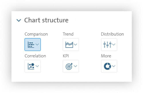
The comparison – display of differences between groups or mapping of time-based developments
The “Comparison” tab index includes bar and column diagrams, combined column and line charts, stacked bar and column charts in different characteristic values as well as the waterfall chart. These visualization options are particularly suitable for showing differences between groups or mapping a time-based development.
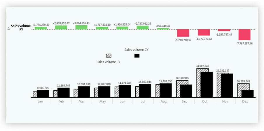
Bar and column charts are used for numerical series or enumerations that are directly compared with each other or analyzed. It is also possible to display further information in the graphic, such as variances, reference lines or threshold values. The column chart of figure 2, for instance, clearly shows the sales volume figures per month including the variances from the previous year.
Trend – simple analysis of developments and derivation of forecasts
The “Trend” tab index helps the user analyze a development through visualization options, such as stacked areas, line charts and time series.
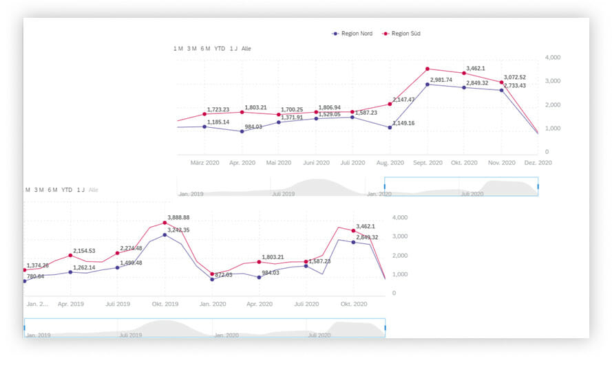
The line chart is particularly suitable for displaying historical data over time. Here, data points are connected by lines. The graph resulting therefrom illustrates a trend and helps recognize it.
Figure 3 shows the example of a time series. A time series is a line chart providing the user with additional interactivity.
The end user, for instance, can variably change their display period using a time bar that can be moved freely on the time line. Consequently, the user is very flexible and can quickly recognize different trends and derive measures.
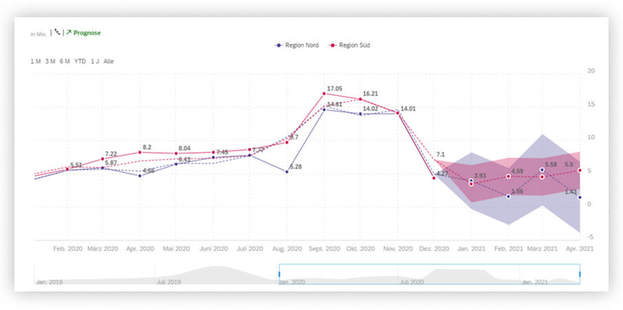
Moreover, the time series includes another function that can be used to easily create and trace forecasts. For this purpose, the statistical “linear regression” and “triple exponential smoothing” methods are provided, which are frequently used for time series forecasts.
In figure 4, for instance, a sales volume forecast is calculated from January 2021 to April 2021 by means of an exponential smoothing.
The number of forecast months directly depends on historically available months. If the number of historical months available ranges from one to eight, only one forecast month is possible. As from at least eight historical months, the possible number of predictable months is calculated using formula “(number of historical months 8) * 0.25”.
This means, for instance, that seven months “(36 8) * 0.25 = 7” are predictable for 36 historical months.
Distribution – easy recognition of correlations
The “Distribution” category provides charts that can be used to illustrate how individual values are distributed and displayed in terms of size within the data. SAP Analytics Cloud facilitates the display by offering the following display options: boxplot, heatmap, bar chart, spider web chart and treemap.
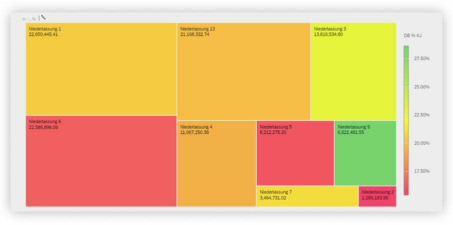
The treemap chart visually uses structures and colors to make correlations recognizable. The size of the nested rectangles represents a proportional value. The color gradient of the tiles shows a value range that can be used, for instance, to display key figures in relation with each other.
According to the scale in figure 5, the size of the tile, for instance, shows the sales volume and the color represents the profit margin.
The correlation – automated creation of clusters and groups
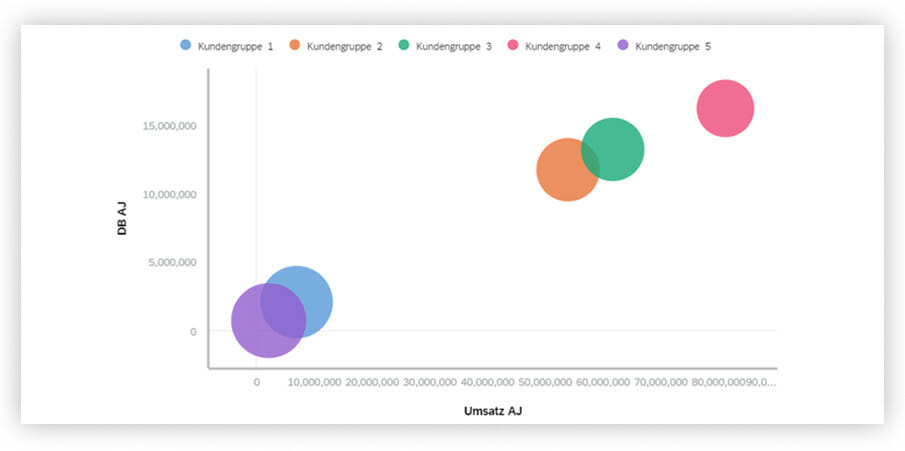
The “Correlation” selection includes the bubble chart, the cluster bubble chart and the scatter chart.
The bubble chart is a visualization type that is created with two or three variables. One key figure each can be found on the x and y axis, a third key figure is reflected in the size of the bubble. In addition, the color of the bubble can be used for a schedule line according to customer groups for instance.
SAP Analytics Cloud provides the “Intelligent groups” function that can be used to automatically create related groups by means of algorithms and machine learning and display them in clusters.
KPI – clear display of key figures
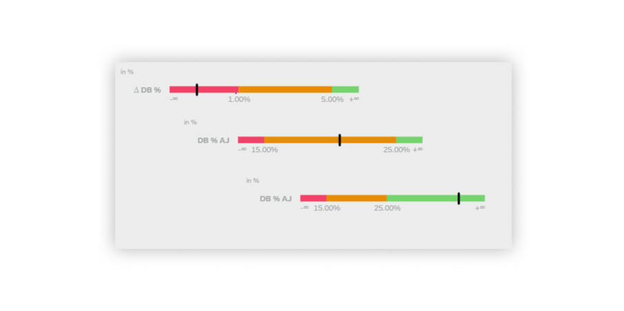
The “KPI” (Key Performance Indicator) tab index includes charts for displaying key figures purely numerically or illustrating them graphically by means of a bullet chart.
Display form “Numeric point” means that several key figures can be displayed as primary or secondary values and additionally amended with absolute or percentage variances. It is also possible to define value ranges and highlight them in color so that, for instance, a negative value will always be displayed in red and a positive value in green.
The bullet chart assigns the key figure to a colored value range on the scale. These value ranges are defined before and can map several areas on the scale. Such charts can be used to recognize key figures relative to a defined scope at a glance and analyze them.
More – further useful visualizations
Menu option “More” includes doughnut and pie charts as well as the Marimekko chart.
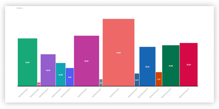
The Marimekko chart is similar to the bar and column chart; however, it is big enough to include another key figure which is displayed over the width of the column.
In this example, the height of the column shows the sales volume per branch office. At the same time, the width of the column represents the profit margin per branch office.
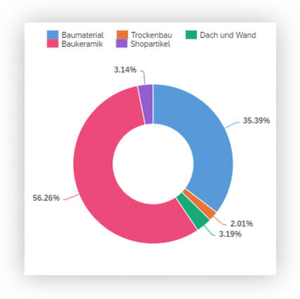
The doughnut and pie charts can be used to illustrate parts of the whole. Every section corresponds to a different characteristic, which altogether amount to 100 percent.
Figure 10, for instance, shows the sales volume percentage according to individual divisions.
Conclusion
The SAP Analytics Cloud solution offers a wide and new range of visualization options and analysis functions for business communication. Depending on requirements, graphics and charts are individually provided for various analysis scenarios.
The way information is displayed plays a decisive role in business communication. Information must be formatted and displayed clearly and understandably so that the consumer can understand the graphic immediately.
Interactivity and ad hoc analyses offer the end user a new view on company data.